~*~ New Forum Design - Information and Bug/Feedback Reports ~*~

Wobbles

BnB Co-Founder ~ Retired
Joined
Aug 31, 2006
Messages
90,191
Reaction score
40
Hello everyone!

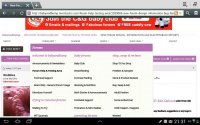
As most of you should have read BabyandBump was due to be updated today with a new theme which is now in place.

Some feedback already is split however if you do not like the new look don't panic with a few clicks through your User CP - Edit Options under forum skin at the bottom of the page you can return to the previous template by selecting BnB.Momtastic.

Please feel free to leave constructive feedback on this thread and for anyone who quite likes the new theme if you too have any feedback, suggestions or any bugs to report please do so here. Any screenshots with bug reports would be most helpful where possible.


Wobbles <3
 
It's not that I don't like it, it's just that the stark white is rough on the eyes. If it were a diff color I'd be okay with it :thumbup:
 
^^ Agree, the lots of white is really hard on the eyes. Otherwise I like it, it looks slick :). Oh but I can't bring myself to click the 'thanx' button' I'm scared my old English teacher will jump out and shout at me...
 
I'm not sure if I like it, it will take some getting used to x
 
I think it looks great! :thumbup:

The only things I would change is I'd make the page margins surrounding the "boxed" area very very light purple or pink (kind of like it is when you click on the forum jump or search menu etc) since the white is a bit much, and I'd make the text size smaller (or less spaced out?) in thread titles as well as the forum jump menu :flower:

Other than that the purple is perfect (fave color :haha:) and I think it's a lovely change! :thumbup:
 
Some posts are bold, some aren't.

Full site, Samsung Galaxy S3

https://i1127.photobucket.com/albums/l634/hakunamatata2012/Screenshot_2013-10-21-16-24-20_zps7ec0f8fa.png
 
The writing flickers between normal and a fuzzy bold. It's distracting x
Just to add I'm using a samsung tablet.
 

Attachments

  • 2013-10-21-21-31-22.jpg
    2013-10-21-21-31-22.jpg
    40.7 KB · Views: 27
I'm sad the retro skin disappeared a minute ago. I loved no ads! :haha:
 
I changed my skin and when I came back it was back to the stark white...not a fan :nope:
 
Switched to the old skin for now I like the new one I'll use it when it has no bugs :D
 
I've reverted to the old skin, the text was far too big and messy (I'm using iPad)
 
I've gone back to the old skin. It's just too bright and gives me a headache.
 
Love the fonts used, and how feminine it is! I agree it's a tad bright but I think I'll get used to it

Will there be no update for the mobile version? I use mobile most, it'd be nice to have a change to the colour scheme on that! :)

All in all I think it's pretty good, once bug fixes are done it'll be great - love the fact there's the option for the old layout x
 
Ooh also in my signature, I've put it all to the same font but with the update my journal link is now appearing as if it's a different font? Not a big deal but yno :haha:
 
sorry not a fan will be using the old skin. There is too much 'white' far to dazzling on the eyes
 
What colour is the new one? I've had to go back to the old one as the white has an almost 'pearlescent' look to it. It's almost like looking at an optical illusion (it ripples if that makes sense?) and was making me feel a bit travel sick and giving me a bit of a headache.

I like the writing, but the colour is too much for me to bare.
 

Users who are viewing this thread

Members online

Latest posts

Forum statistics

Threads
1,650,202
Messages
27,141,465
Members
255,677
Latest member
gaiangel
Back
Top
monitoring_string = "c48fb0faa520c8dfff8c4deab485d3d2"
<-- Admiral -->